The home page's system, extended to the surfaces the rest of the site needs.
Four working surfaces and a component reference, built only from tokens read out of
index.html. Everything here loads the same three stylesheets a production
page would.
Four surfaces the record project actually needs — plus the evidence they came from.
Each one is a real interface, not a swatch board — built to be lifted into the site as-is.
Register browser
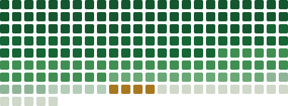
The 197-match prototype field wired to a sampled-record table — isolate a source group, inspect its matches.
Case file
A single investigation: the ledger, the deed table, the decision timeline, and a stated-limitations block.
Corrections & records request
The quiet official form — the one surface where a resident writes back to the record.
Component reference
Every component in one place, with its source line and its provenance.
The source home page
The redesigned home page this entire system was read from. The only evidence.
Preview cards
Twelve focused review cards: color, type, spacing, elevation, components, data, assets, applied UI, type audit, token roles, light/dark.
Four rules that keep an applied page inside this system.
They are not style preferences. Each one is a behaviour the home page already commits to, and breaking it changes what the project claims about its own evidence.
Copy four files, then keep the load order.
Link the three stylesheets, in order
colors_and_type.css → tokens.css → app.css. Later files depend on earlier variables.
Add app.js with defer
Behaviour is opt-in by markup attribute. A page with no .rv and no [data-count] simply runs nothing.
Open with topline, skip link, masthead
Then <main id="main">. The disclaimer tag is part of the masthead, not decoration.
Wrap every band in .wrap
1180px, 28px gutter. Sections alternate section.band, .field (white) and .feat (dark) — at most one dark band before the footer.
Give every claim a .src line
Register, retrieval date, or the limitation. A figure without a receipt does not ship.
Close with the ink footer
Wordmark, disclaimer, file links, and the three-part mono colophon.
app.css under the EXTENSIONS banner, and label it in
components.html. Never let an extension pass as source evidence.The same five components, as React modules.
For porting the system into a React codebase. They emit this system's class names and nothing else —
no inlined token values, so a change in colors_and_type.css still reaches them.
components/Stamp.jsx ·
components/Panel.jsx ·
components/FilingCard.jsx ·
components/Ledger.jsx ·
components/RecordField.jsx
— each assigns its browser global, so they load as plain scripts with no bundler.
Power-plant redevelopment
The deeds, votes, and declared recusals behind the lakefront land deal.
Static export shown until React mounts. Once live, hover, focus or click a chip to isolate a register; Escape clears.
The CSS layer stays dependency-free — React here is the one optional exception, loaded only by this demo. If it fails to load, the static markup above is what you see, and every other page in the kit is unaffected.